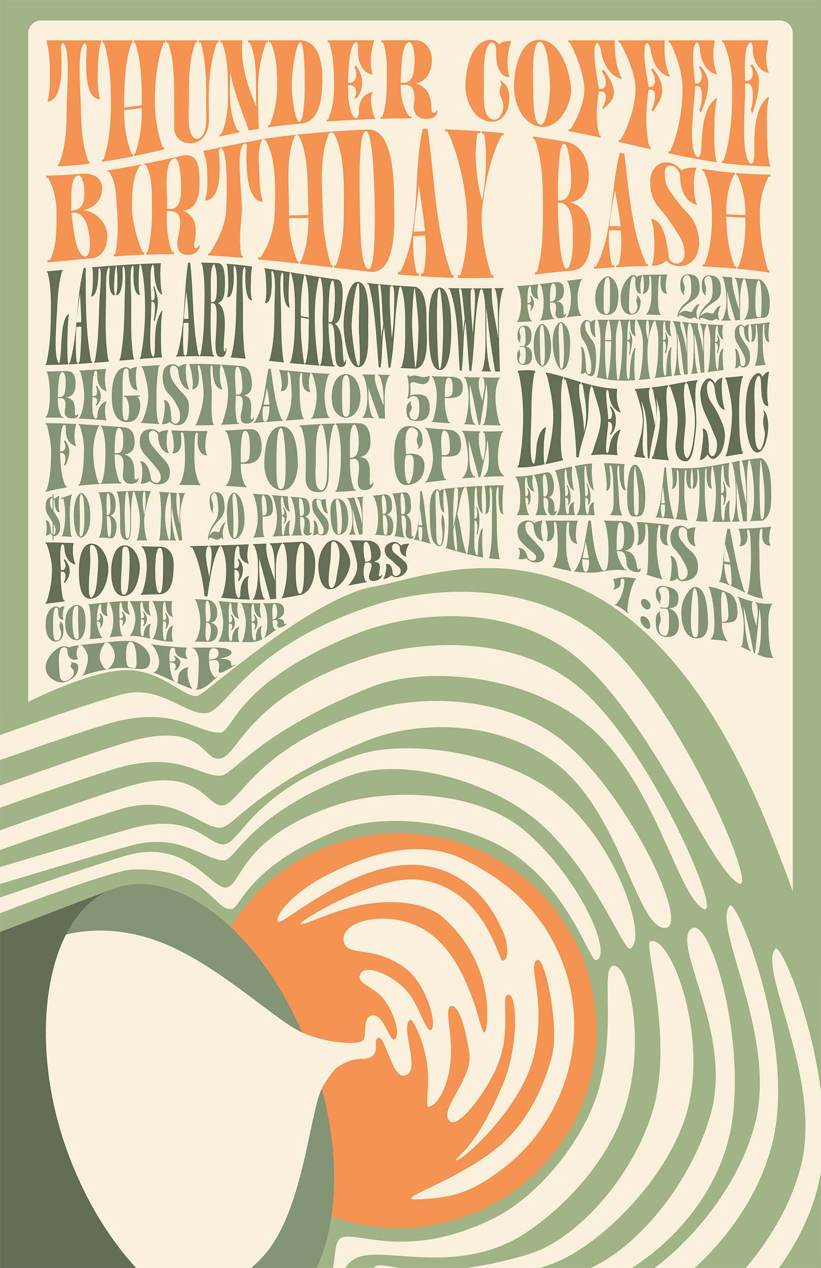
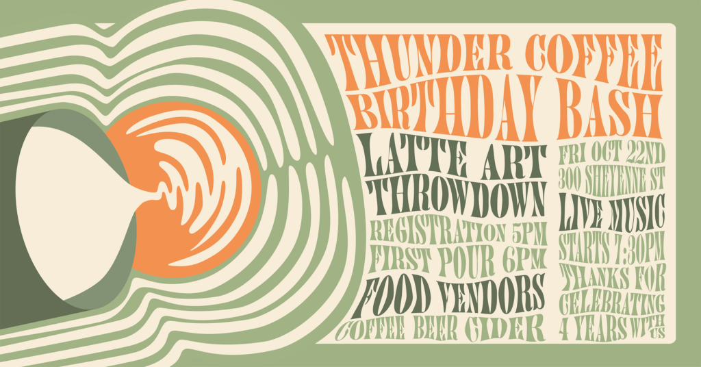
For Thunder Coffee’s 4th birthday event, I had free rein with the design. I knew I wanted the design to focus around the latte art throwdown aspect of the event. Thunder uses a lot of western-influenced branding, so I first tried drawing a cowboy pouring latte art. After several attempts, I wasn’t liking how that was turning out and decided to save that idea for later. The deadline to get the poster printed was approaching, and I needed something to announce the event with.
I had recently been doing research on 1960s concert poster designs, and I realized the backgrounds in those contain a lot of swirls similar to those in latte art. I wanted to explore using latte art to create that style while maintaining a focus on the cup and milk pitcher.
From there I found a 60s-influenced font for the event details. To match the wavy text used in concert posters, I played around with warping the font. I wanted it to be readable but still require you to stop and take a closer look to get all the info.
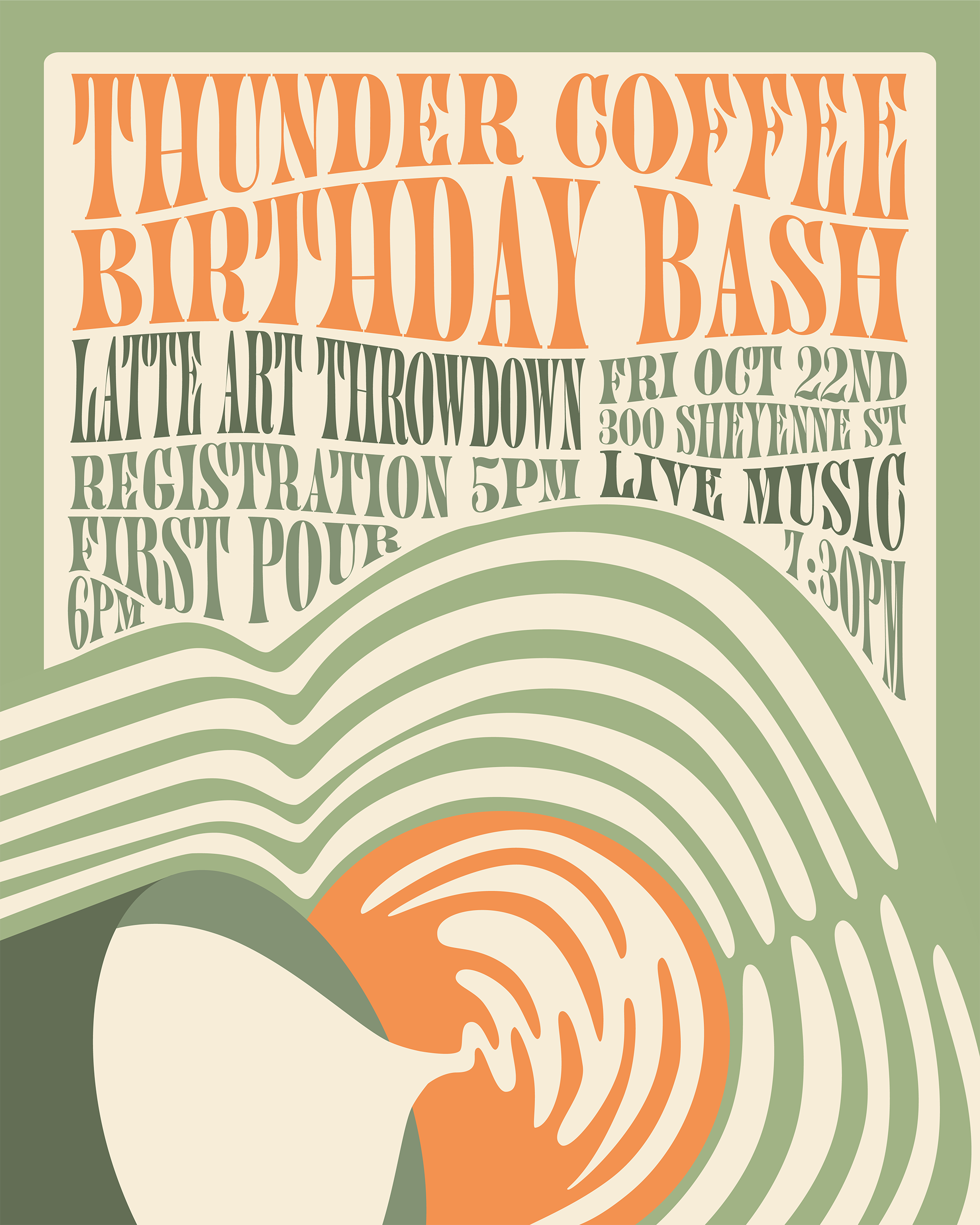
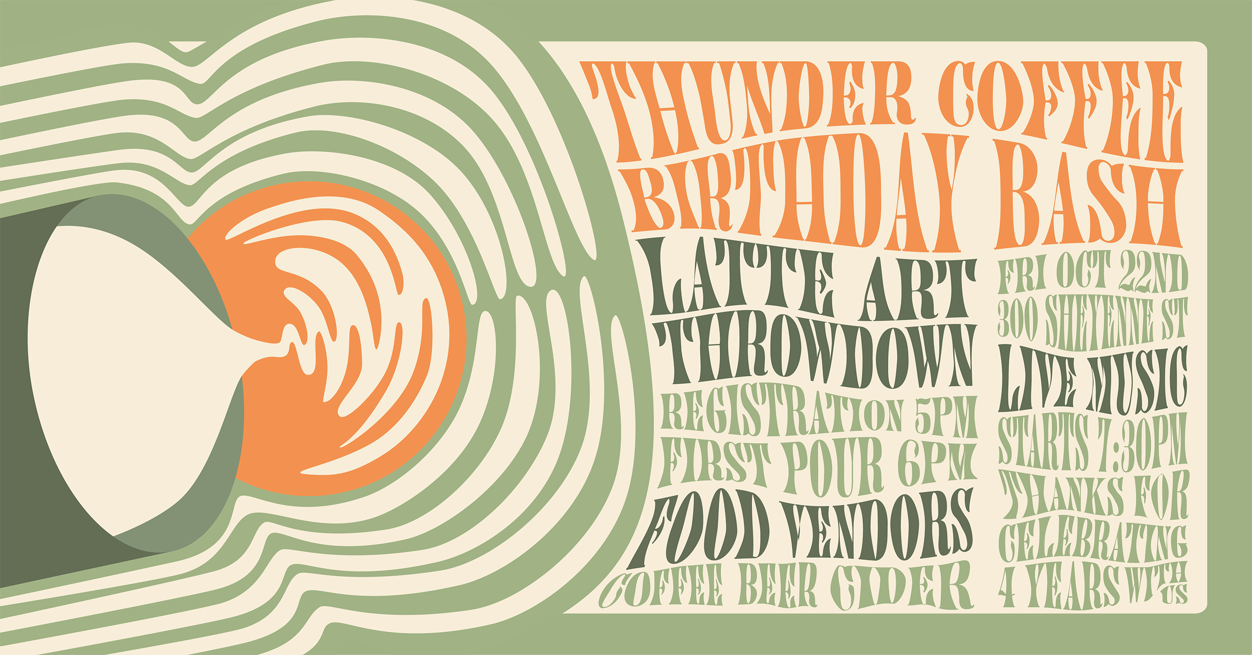
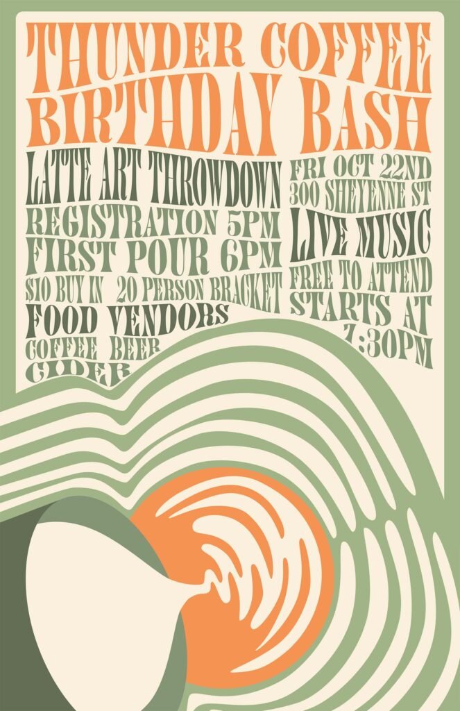
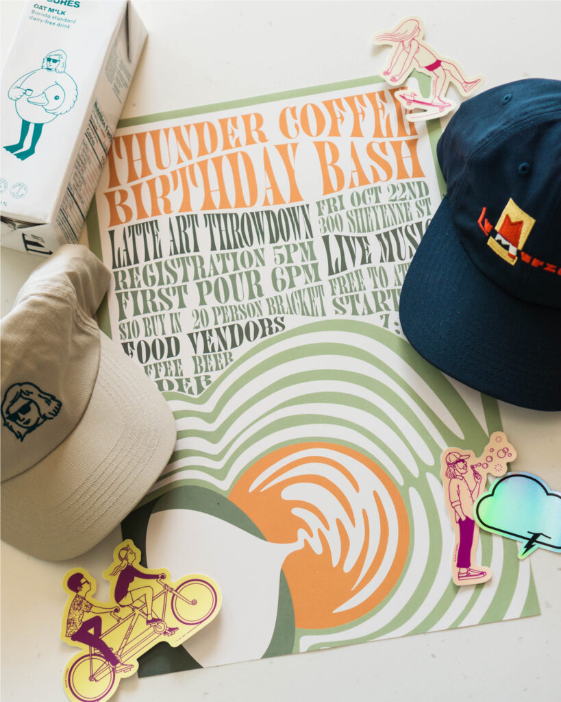
Above all are versions of the poster. The first was for 11″x17″ print posters, the second is a sketch of the original character concept, the third is sized for Instagram, the fourth is a Facebook event cover, and last is the printed poster.
Event Poster
Event Poster
For Thunder Coffee’s 4th birthday event, I had free rein with the design. I knew I wanted the design to focus around the latte art throwdown aspect of the event. Thunder uses a lot of western-influenced branding, so I first tried drawing a cowboy pouring latte art. After several attempts, I wasn’t liking how that was turning out and decided to save that idea for later. The deadline to get the poster printed was approaching, and I needed something to announce the event with.
I had recently been doing research on 1960s concert poster designs, and I realized the backgrounds in those contain a lot of swirls similar to those in latte art. I wanted to explore using latte art to create that style while maintaining a focus on the cup and milk pitcher.
From there I found a 60s-influenced font for the event details. To match the wavy text used in concert posters, I played around with warping the font. I wanted it to be readable but still require you to stop and take a closer look to get all the info.
Above all are versions of the poster. The first was for 11″x17″ print posters, the second is a sketch of the original character concept, the third is sized for Instagram, the fourth is a Facebook event cover, and last is the printed poster.